N&L: Navigation Redesign
- Role
- Sole Product Designer
- Timeline
- 2 months
- Team
- Product Designer, Product Owner, Frontend Developer
01. Overview
Nodes & Links is a project intelligence platform that helps planners, schedulers, and risk managers analyse complex project schedules. The product includes analytics within each project, a portfolio environment, administration tools, and AI capabilities.
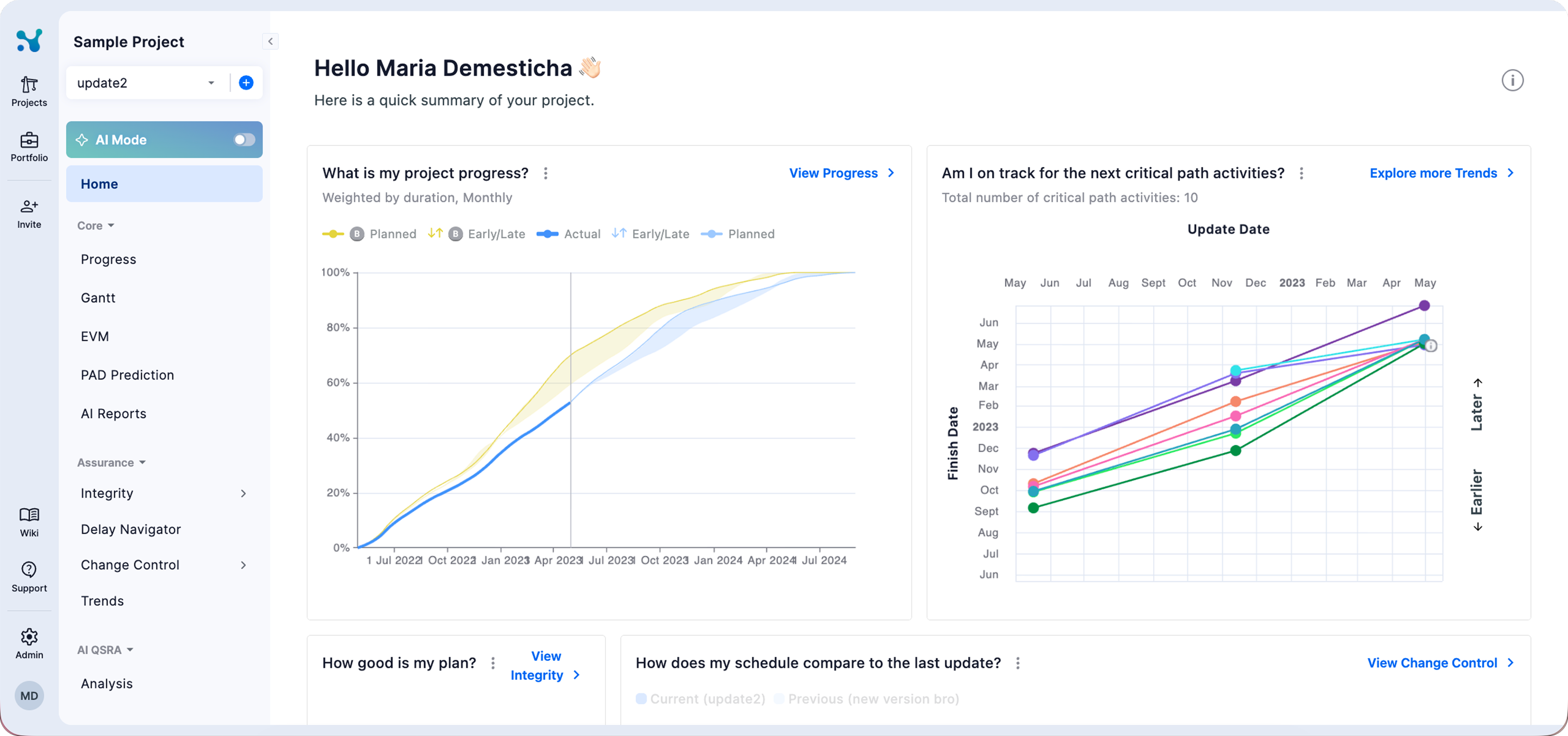
As the platform expanded, its navigation stopped reflecting the structure of the product. The left sidebar gave users detailed access to pages inside the selected project, such as Home, Gantt, Integrity, and Delay Navigator. However, major environments such as Portfolio and Admin were represented by small grey icons in the upper right corner, alongside utilities, help, invitations, and account controls.
The interface also lacked a consistent visual language. Sharp containers, elements with low contrast, unnecessary divider lines, and inconsistent icon usage made the experience feel fragmented and increasingly dated.
As the sole product designer, I was asked to explore solutions for improving the navigation. Over two months, I audited the existing product, benchmarked familiar navigation patterns, developed multiple structural directions, designed the final system and its states for each role, and worked with the product owner and frontend developer to carry it through implementation.
02. Research
Framing the navigation problem
I began with a product audit and stakeholder feedback to identify where the existing hierarchy was breaking down. I then used Mobbin to study how established products such as Slack and Gmail separate global destinations from contextual navigation.
The research was guided by four questions:
- 01How should users distinguish switching between environments from navigating within a project?
- 02Where should Projects, Portfolio, Admin, and AI live within the product?
- 03How could the navigation accommodate new environments and different permission levels?
- 04How could the product preserve enough space for dense schedules, tables, and analytical content?
03. Solutions
1. Making product environments visible
The existing sidebar described the selected project in detail, but it did not give users a clear map of the wider product.
Portfolio and Admin were positioned in the upper right header as small, unlabelled icons. Because they appeared beside support, settings, invitations, and account actions, the interface presented major product environments as secondary utilities.
The first requirement for the redesign was therefore to give important environments persistent, labelled positions. Users should not need to recognise an unfamiliar icon or open a tooltip to understand the main areas of the platform.
2. Testing where environments could live
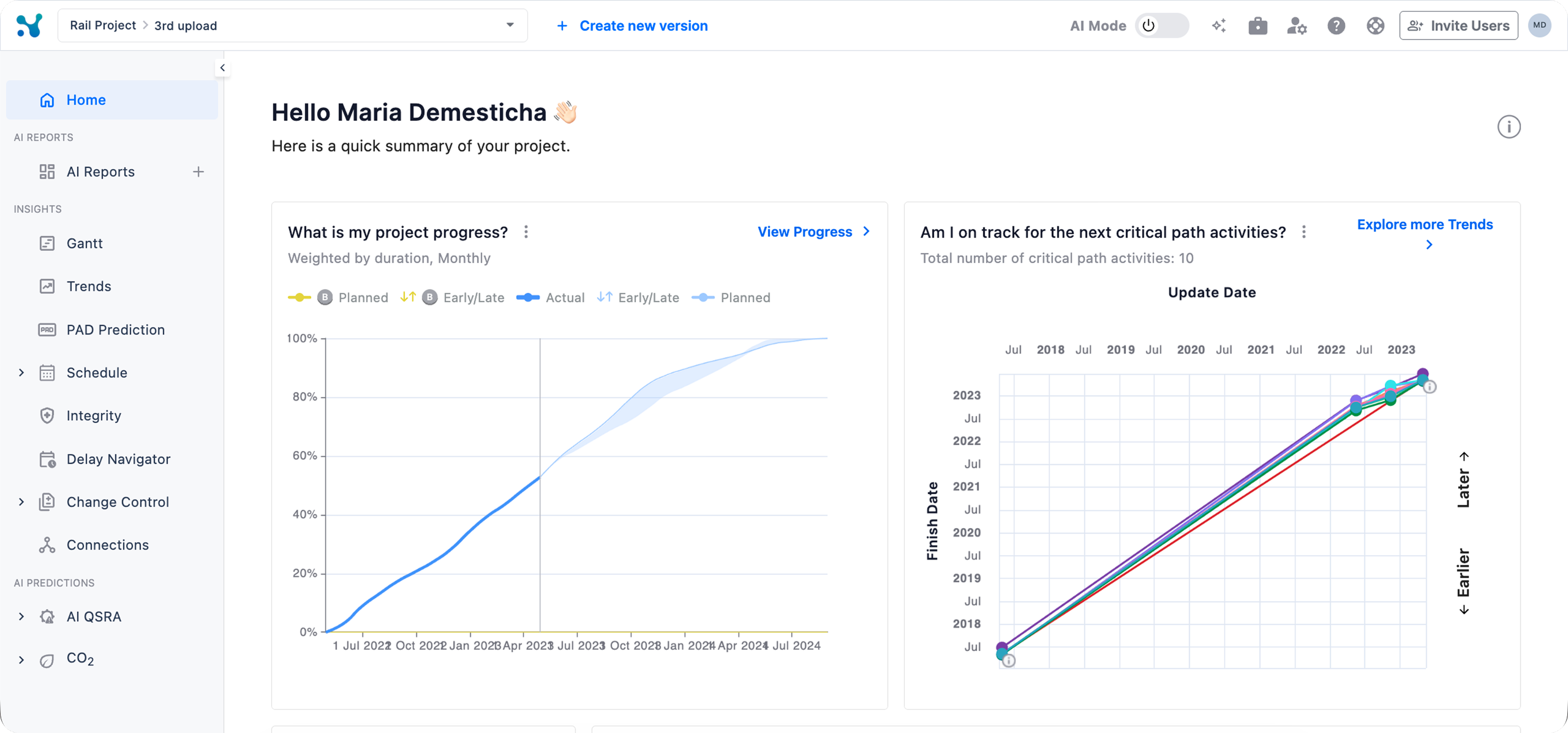
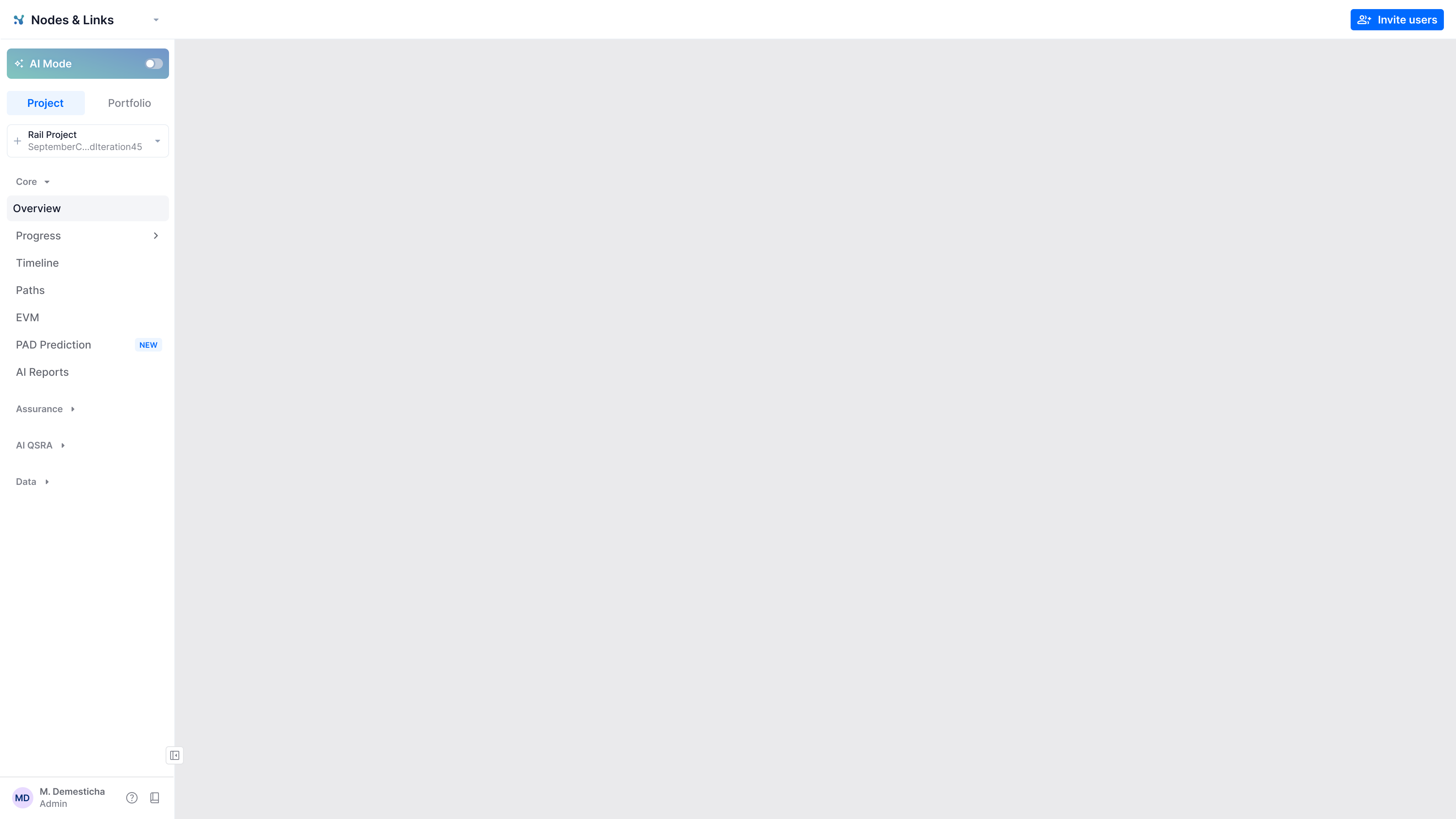
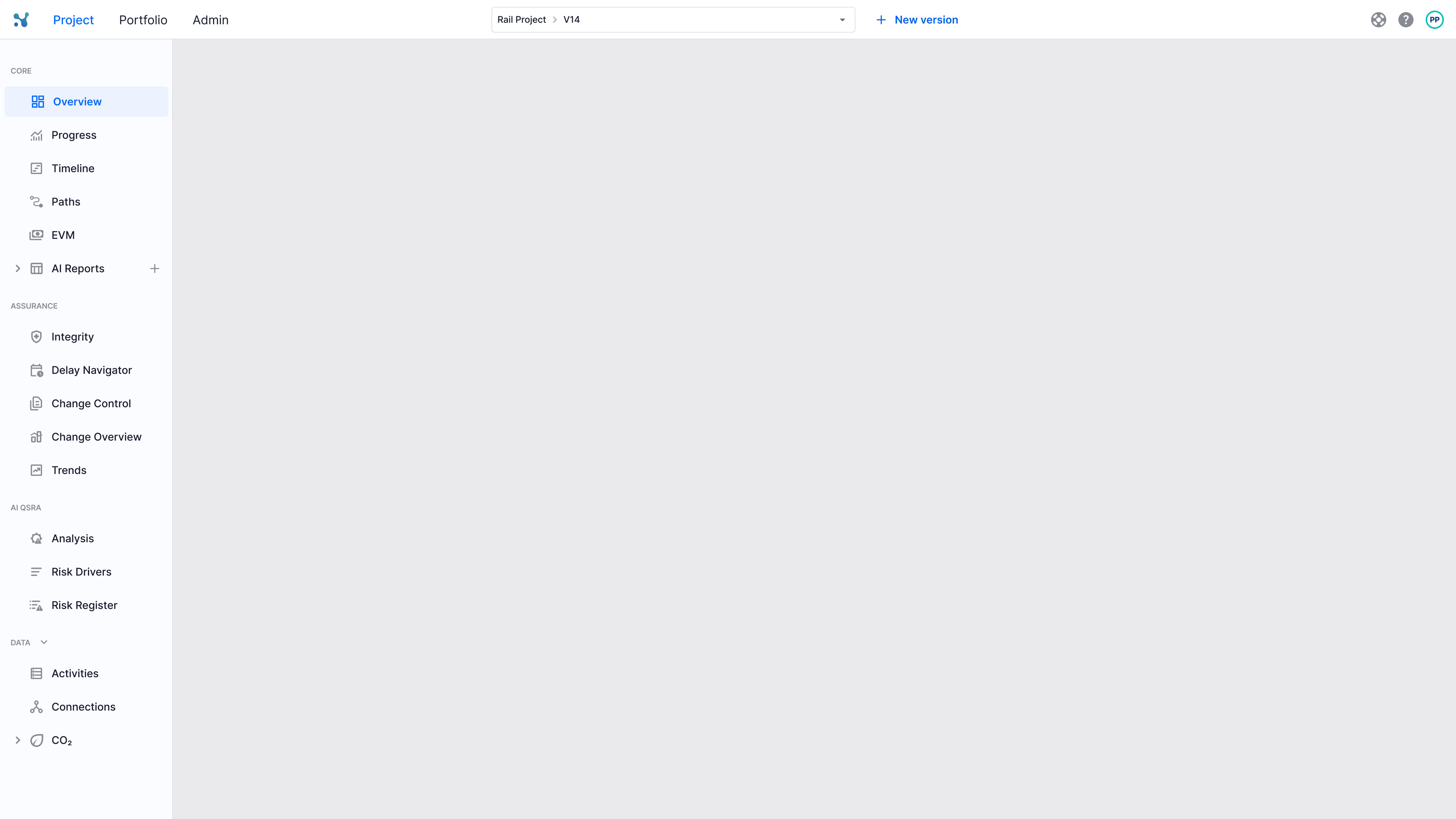
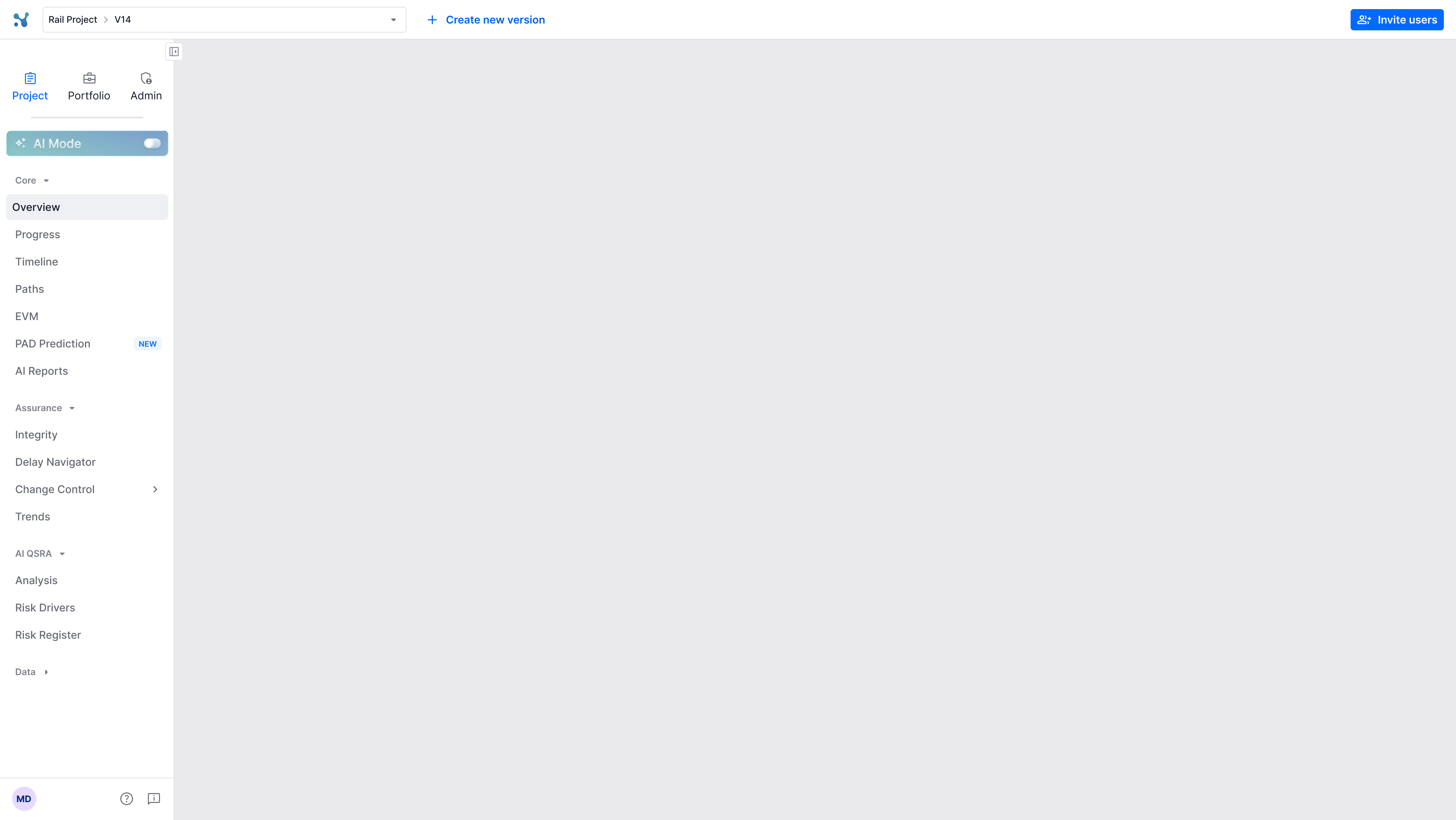
I created a few alternatives focused primarily on the positioning of the environments rather than visual styling. Keeping the styling broadly consistent helped the team compare structural tradeoffs without turning the discussion into a matter of aesthetic preference.
The alternatives explored three main models:
- Environment tabs inside one sidebar: compact and explicit, but global and contextual navigation competed within the same surface.
- Environment navigation in the header: separated the two levels, but added more responsibility to an already busy header and became harder to scale.
- A primary rail with a contextual sidebar: required more horizontal space, but created the clearest and most scalable separation between product navigation and page navigation.
My initial exploration did not lead to an immediate decision. The product owner later investigated the same navigation problem independently, and both explorations converged on the two sidebar direction I had supported. This gave the team greater confidence that the decision was grounded in the product hierarchy rather than visual preference.
3. Separating global and contextual navigation
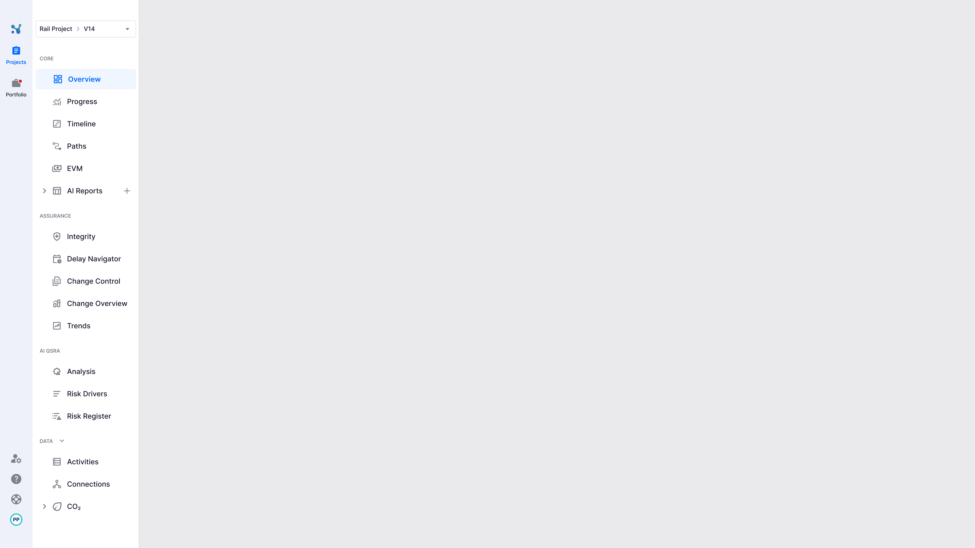
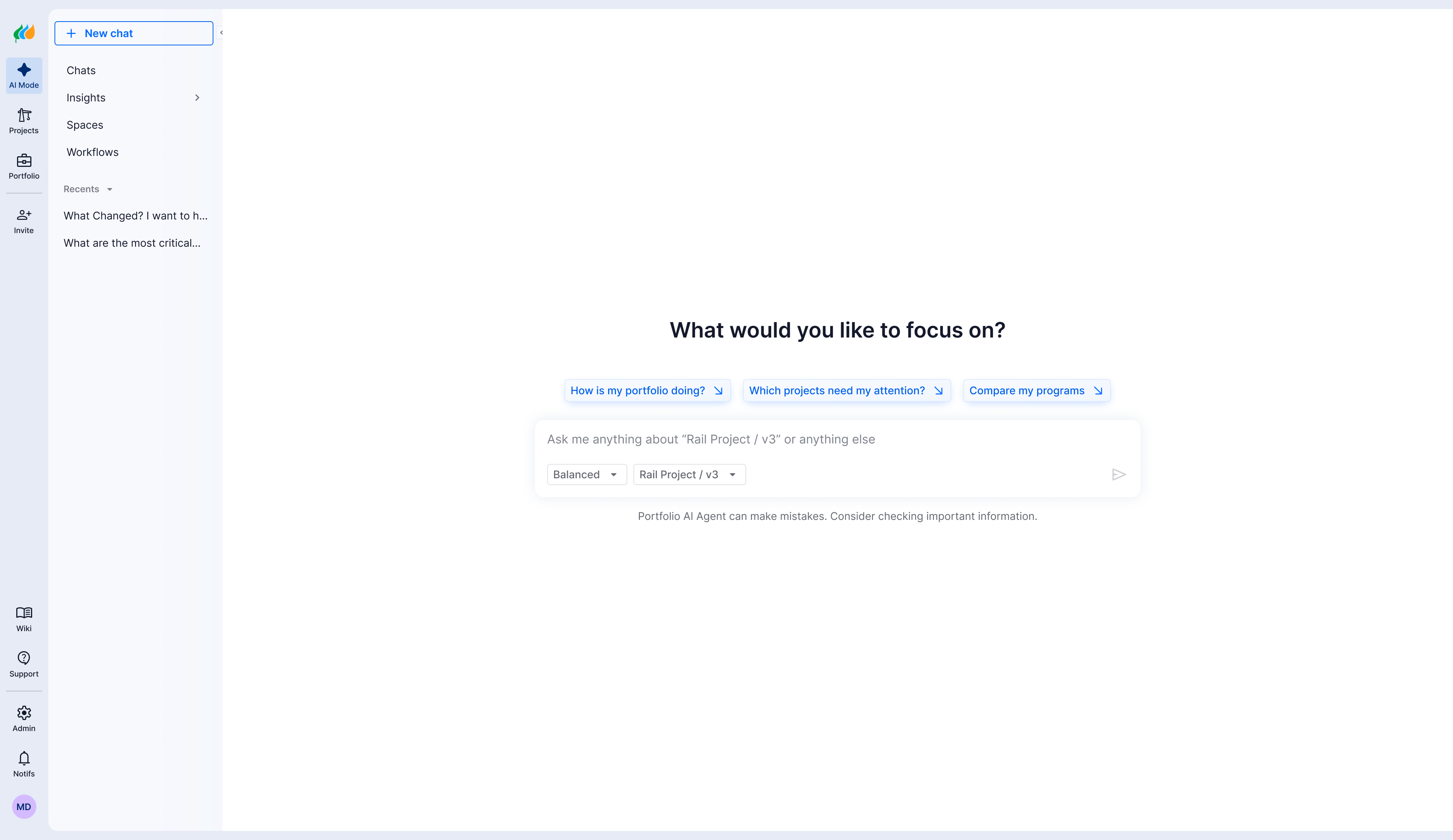
The selected direction introduced two persistent navigation levels.
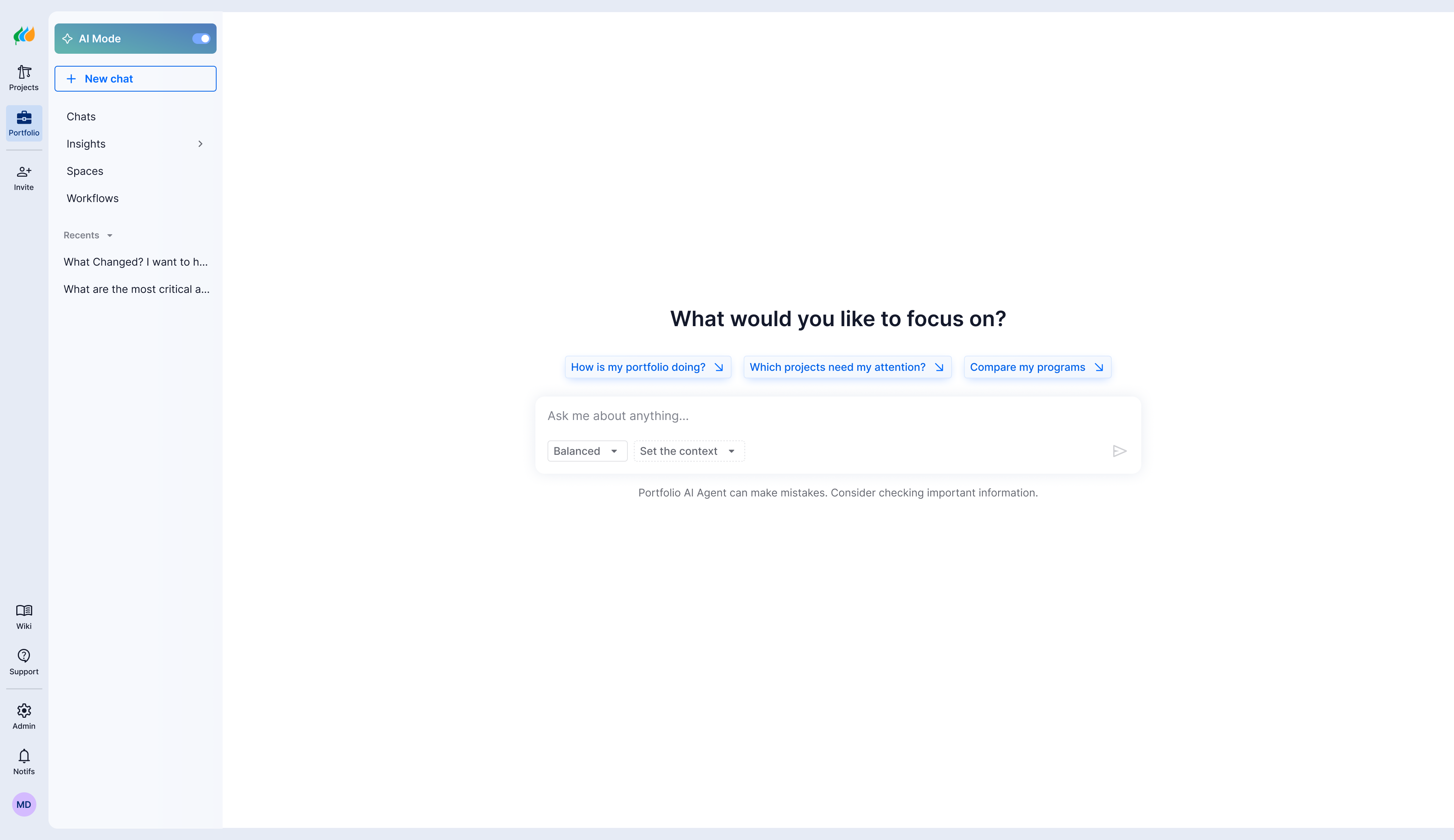
The narrow primary rail contains product destinations and global utilities. The adjacent contextual sidebar contains the project name, selected version, AI Mode, and the pages belonging to the active environment.
This creates a visible relationship:
Environment → Page → Task
Users can understand both their position in the overall platform and their location inside the selected environment. Projects, Portfolio, Invite, Wiki, Support, and Admin also receive stable, labelled positions rather than being scattered across the header.
The main tradeoff was horizontal space. Because users work with dense schedules, charts, and tables, I designed the contextual sidebar to collapse when more workspace is needed. The primary rail remains visible, preserving access to the product’s main destinations.
The new structure also allowed us to simplify the header and keep controls for the selected project close to the navigation they affect.
4. Designing for an unresolved AI strategy
During the project, AI Mode’s future position had not yet been decided. It could remain a feature within Projects or evolve into a product environment with a wider scope.
I created two final versions:
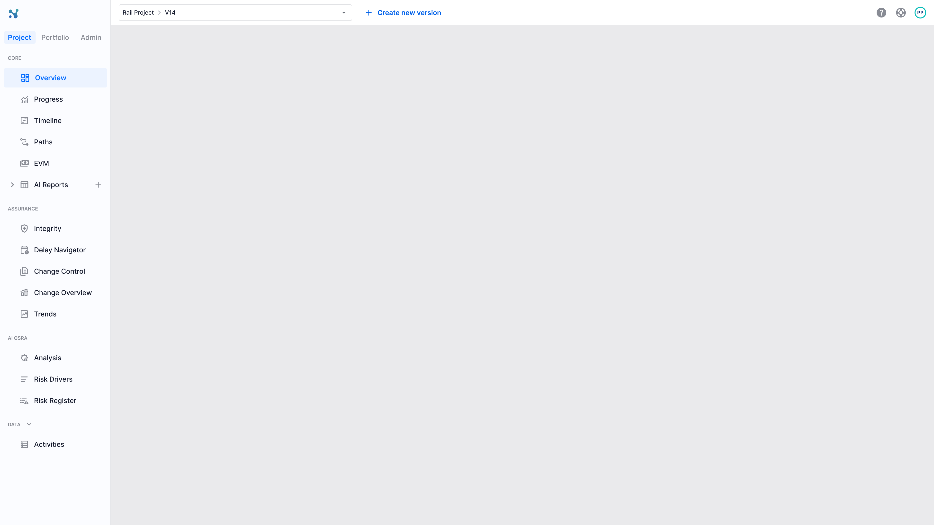
- AI Mode as a project feature, positioned in the contextual project sidebar.
- AI Mode as a global environment, positioned in the primary navigation rail.
The first version keeps AI close to the project context it currently uses. The second allows AI to operate across the platform as an independent environment.
At the time of this case study, the first version is being used for the current implementation. The second version, where AI becomes a product environment, is planned for the next release.
Because both versions use the same underlying navigation model, AI can move from the contextual sidebar to the primary rail without restructuring the rest of the project navigation.
5. Turning the structure into a complete system
The navigation redesign was accompanied by a broader visual and behavioural system.
I introduced rounded geometry, softer surfaces, fewer unnecessary divider lines, clearer grouping through spacing and background contrast, and more consistent typography. These changes were not decoration for their own sake: they helped users distinguish the two navigation levels while keeping the analytical content visually dominant.
I also standardised the application of the existing icon library, defining more consistent icon selection, sizing, visual weight, alignment, placement, and state behaviour.
Beyond the static layouts, I designed the complete interaction system, including sidebar collapse and expansion, hover and active states, tooltips, environment transitions, project and version selection, AI Mode behaviour, expandable groups, component states, and relevant edge cases.
Because the product exposes different destinations and actions according to permissions, I created complete flows for each user role. The underlying navigation model remained consistent while the available environments, pages, and actions adapted to each user’s access.
I collaborated closely with the frontend developer during implementation and reviewed the build across four to five design QA cycles. Each review covered visual accuracy, component states, navigation behaviour, interactions, microinteractions, permissions, and complete flows. I documented discrepancies, reviewed the corrections, and repeated the process until the implementation matched the intended visual and behavioural experience.
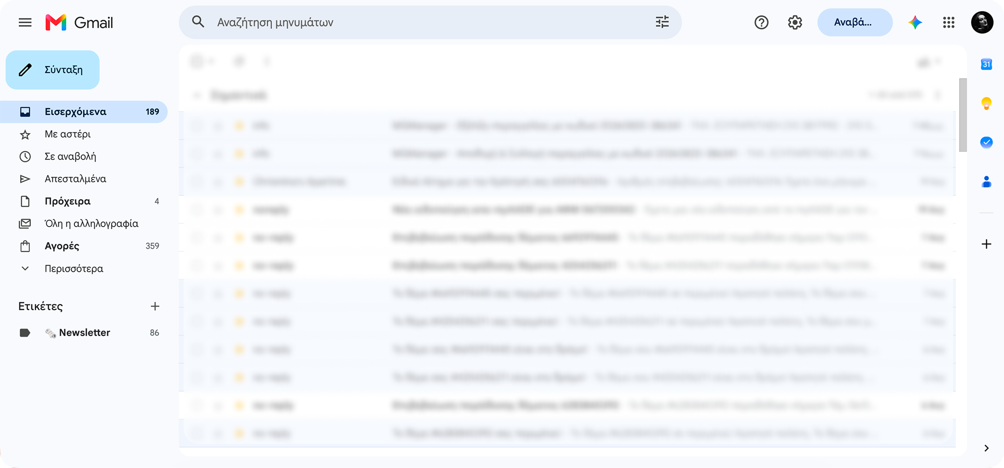
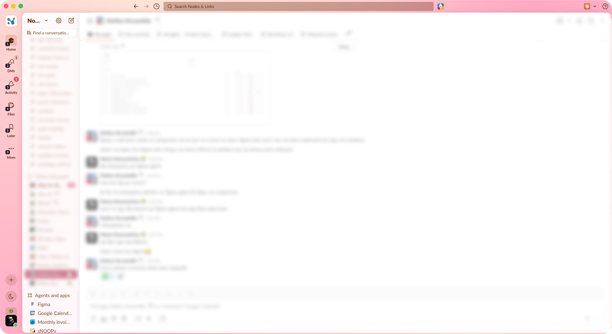
Reference patterns from Gmail and Slack
04. Outcome and next steps
The redesigned navigation is scheduled for release. Quantitative impact is not yet available, so the current outcome should be evaluated as a delivered product foundation rather than a measured behavioural result.
The project delivered:
- A clearer information architecture for the platform’s main environments.
- A scalable two sidebar navigation model.
- A collapsible contextual sidebar for workflows with dense content.
- Two supported positions for AI Mode as the product strategy evolves.
- A more coherent visual and icon system.
- Flows, states, interactions, and edge cases tailored to each role.
- An implementation reviewed across four to five design QA cycles.
After release, the next step is to evaluate whether users discover and move between environments more successfully. Useful measures include environment adoption, navigation errors, time spent locating destinations, support feedback, and qualitative feedback from representative users.