Maria Demesticha
Case studies/JobNRoll

JobNRoll

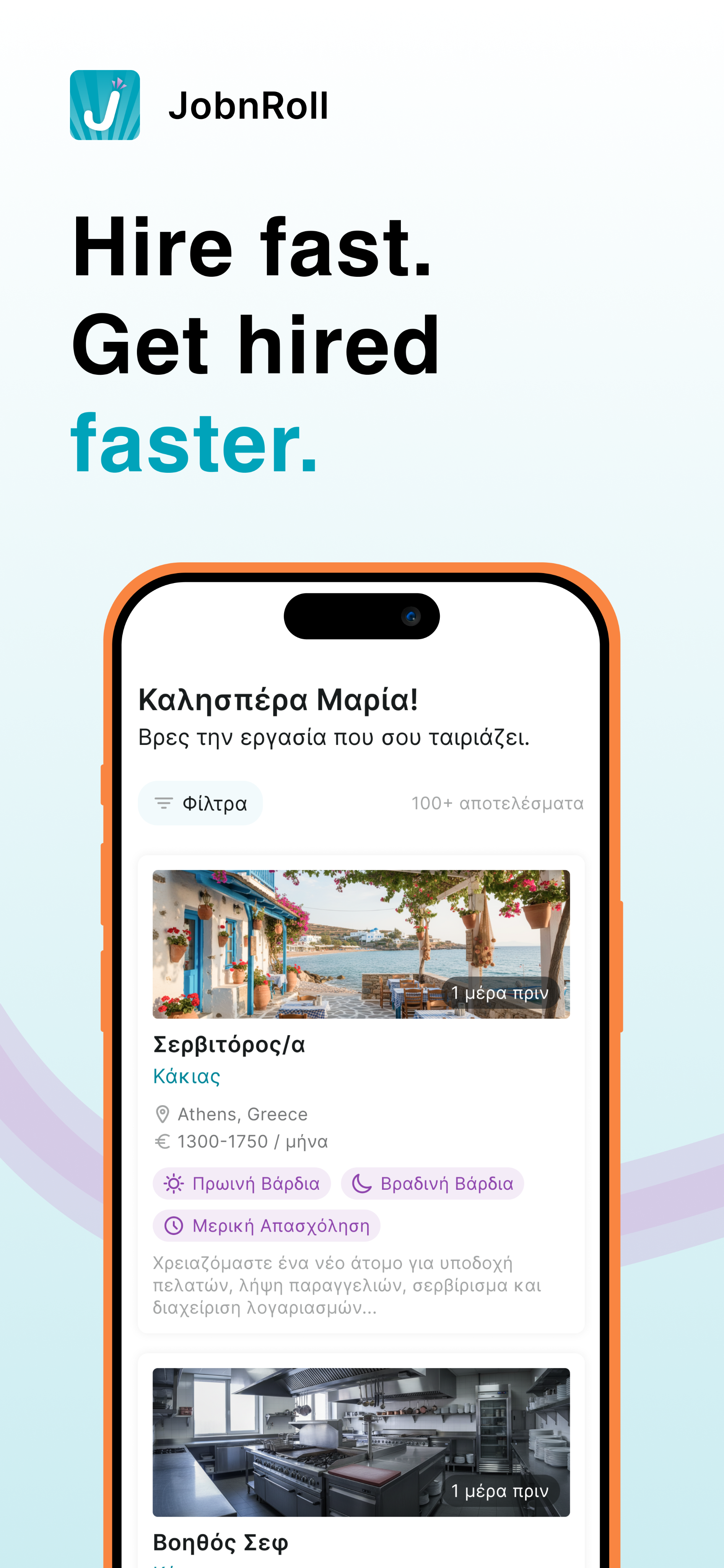
JobNRoll job discovery campaign screen
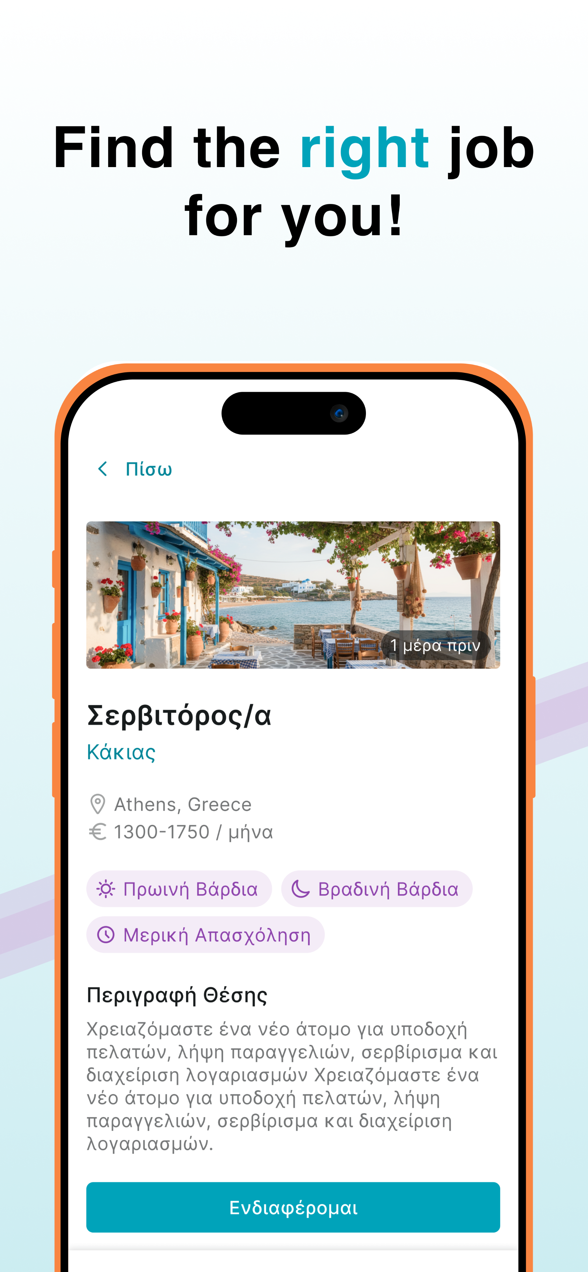
JobNRoll job details campaign screen
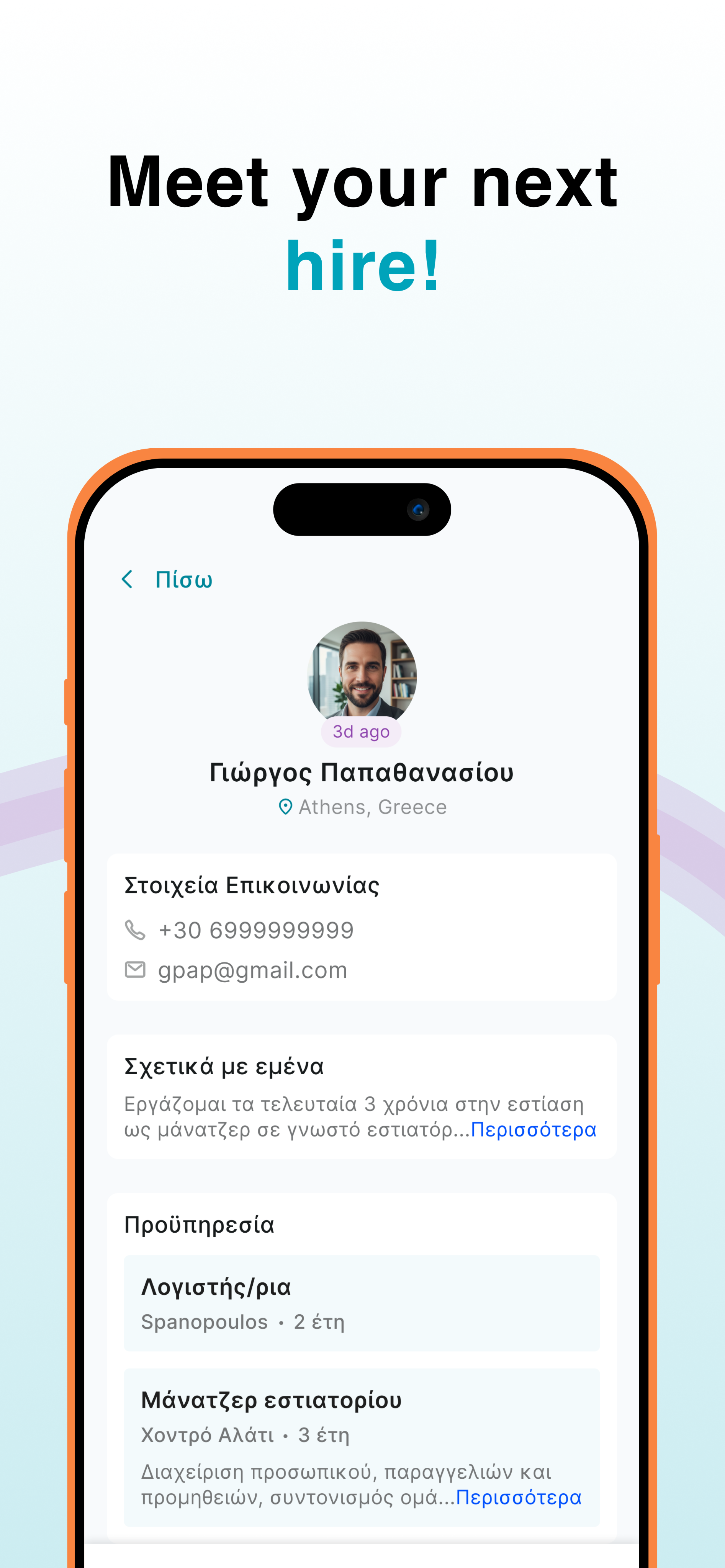
JobNRoll candidate profile campaign screen
Role
Sole Product Designer
Timeline
2 months
Platform
Mobile · iOS & Android
Team
1 Designer · 1 Engineer

A faster route from vacancy to match.

JobNRoll is a two-sided, mobile-first hiring marketplace for candidates and companies across Greece.

The product helps people find work and helps companies hire across hospitality and tourism, retail, construction, healthcare, logistics, and office roles. It is available in Greek and English on iOS and Android.

As the sole product designer, I shaped the end-to-end experience for both sides of the marketplace: onboarding and profiles, targeted job discovery, job details and applications for candidates; and business setup, vacancy publishing, application review, and candidate profiles for companies.

The central design challenge was not a single screen. It was creating two parallel journeys that felt fast and lightweight on a phone, while still collecting enough structured information for people to make a confident decision.

2connected audiences
6job categories
2supported languages

One product, two very different jobs to be done.

I reviewed Greek recruitment products including Joberos and MyJobNow, looking at the route to a first useful result, the information required to create a profile, the clarity of job details, and the effort needed before either side could act.

Rather than treating recruitment as one long form, I framed the product around four questions:

  1. 01How might candidates understand the most important role details at a glance?
  2. 02How can someone apply without rebuilding the same information for every vacancy?
  3. 03How do we help companies assess practical fit without a traditional CV-heavy process?
  4. 04How can one mobile product support two audiences, two languages, and many job categories without feeling complicated?

Designing both sides as one coherent system.

Candidates and companies share the same product, but their priorities and definitions of progress are different.

Candidate holding a structured profile

Candidates

Find a relevant role without repeating the same work.

  • Build one structured profile with experience and preferences.
  • Filter by category, location, radius, shift, and work type.
  • Review salary, schedule, role details, and listing freshness.
  • Apply in one tap, add an optional note, and track status.
A company reviewing structured candidate profiles

Companies

Publish and review from a phone, without a complex ATS.

  • Create a business profile with the essential company details.
  • Publish a vacancy with role, shifts, work type, and location.
  • Receive real-time alerts when a new application arrives.
  • Review structured candidate information and respond anywhere.

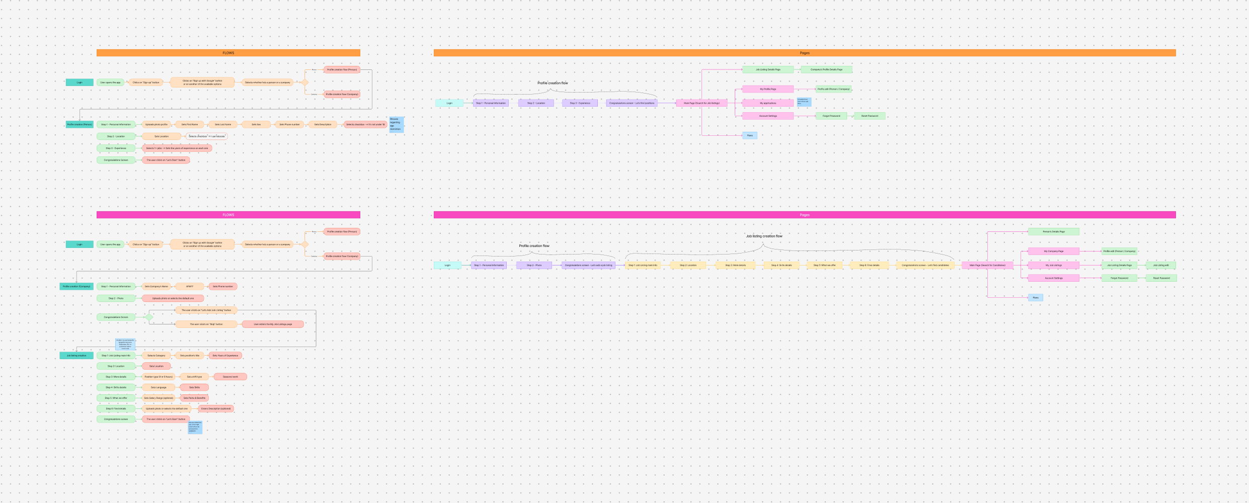
Mapping two complete journeys before designing screens.

I mapped candidate and company onboarding separately, then connected them through the shared objects at the centre of the marketplace: profiles, job listings, applications, and account states.

This exposed where the journeys could share patterns and where they needed to diverge. Candidates move from discovery to application; companies move from setup to publishing and review.

Candidate journey

  1. 01Create a profile
  2. 02Filter and discover
  3. 03Review a vacancy
  4. 04Apply and track

Company journey

  1. 01Create a business profile
  2. 02Publish a vacancy
  3. 03Receive applications
  4. 04Review and respond
JobNRoll candidate and company user-flow map
Candidate and company onboarding, profile, listing, and application flows.Open full-resolution map ↗

Turning the architecture into a testable mobile product.

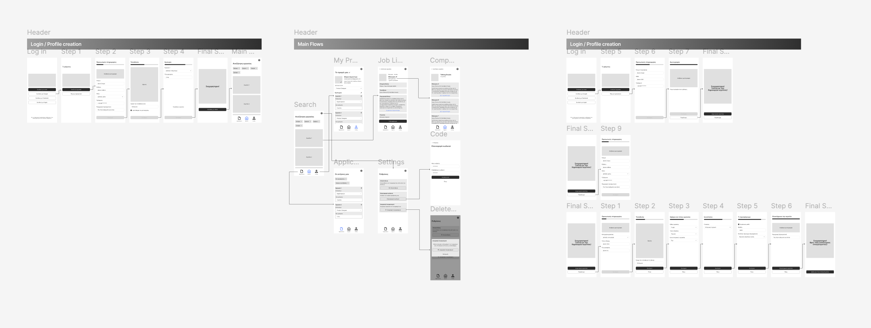
The mapped flows became a low-fidelity prototype covering sign-in, role-based onboarding, profile creation, search, job details, applications, vacancy creation, and account management.

Working in low fidelity first kept the review focused on sequence, required information, and navigation. It also made it easier to compare candidate and company paths before committing to the final visual language.

JobNRoll mobile wireframe and prototype board
Early mobile wireframes connecting the candidate and company experiences.Open full-resolution prototype ↗

Reducing effort without removing decision-making detail.

01

Scan-first discovery

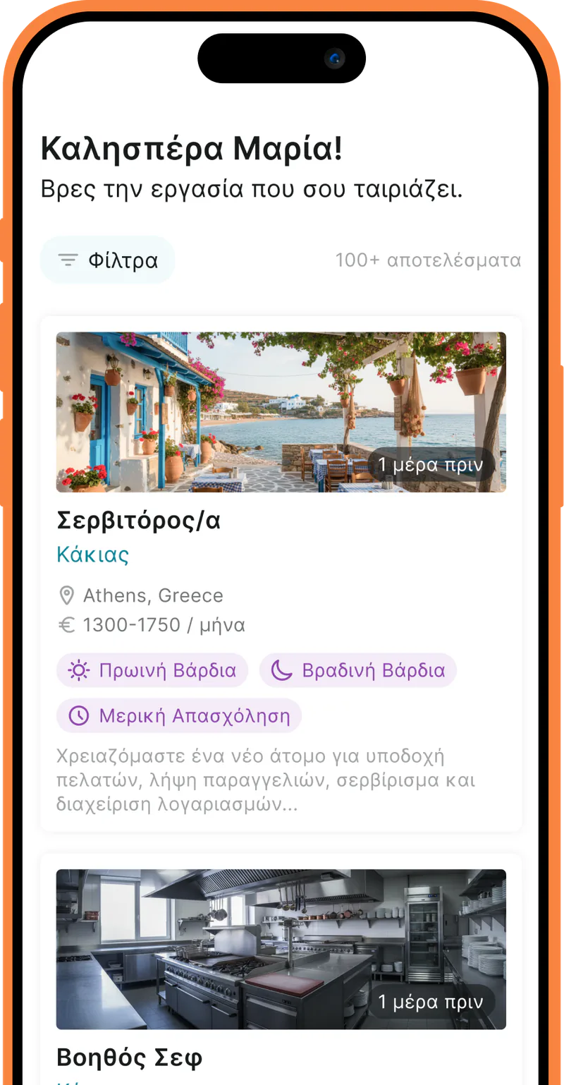
Cards surface the role, employer, location, salary, shifts, work type, and listing freshness before asking candidates to open the full detail.

02

A lightweight application

A saved profile travels with the candidate. Applying takes one tap, with an optional note when more context would help.

03

Practical profiles

Structured fields prioritise the information hiring teams need to judge fit quickly, instead of relying only on a traditional CV.

04

Role-aware navigation

Candidate and company accounts use familiar patterns, while each path reveals the actions and information relevant to that role.

The core experience is now available in market.

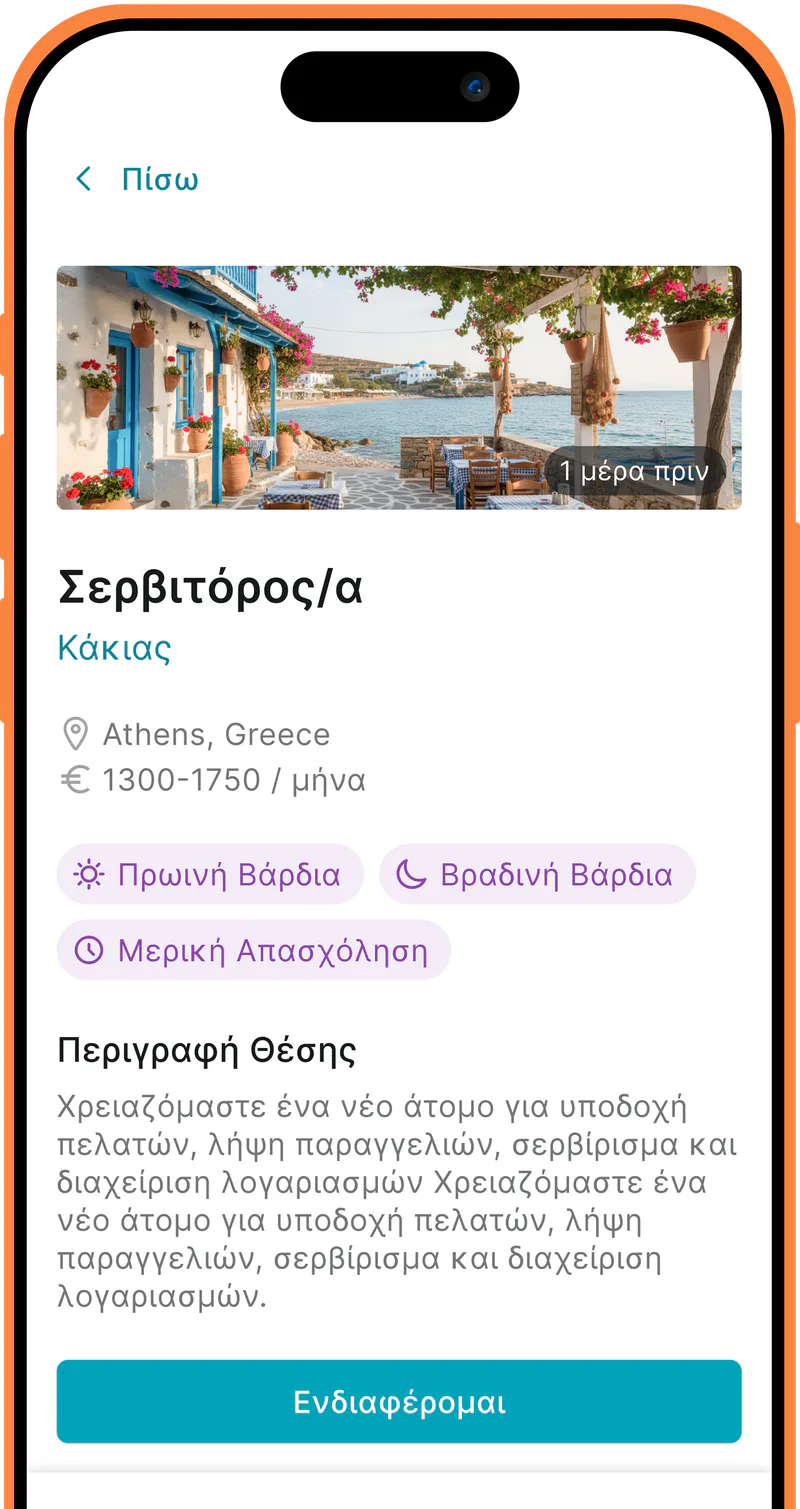
The public product carries the two-sided model into production: candidates can browse tailored listings and open structured job details, while companies can publish roles and manage applications from their phones.

JobNRoll is available across Greece in Greek and English, on both iOS and Android. Because I do not have reliable post-launch behavioural metrics to share, I am treating launch as the implementation outcome rather than claiming unverified conversion or adoption impact.

Hospitality & tourismRetailConstructionHealthcareLogistics & deliveryOffice roles
Live JobNRoll personalised job feed
Live JobNRoll job detail screen